Sunday, April 5, 2015

Sally Hansen Giant Peach

Hi guys! Happy Easter to those who celebrate! Today I have a swatch of Sally Hansen Xtreme Wear Giant Peach for you.


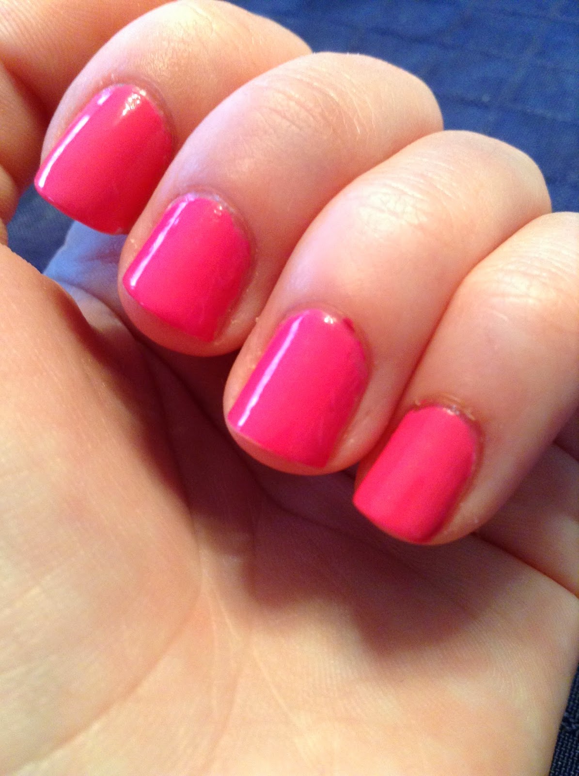
Giant Peach is a pretty warm coral-leaning pink creme. It's on the muted side, so it can be worn to work as it's not too bright. It's very flattering, and I wore this for a few days, which is saying something for me... Usually I change my polish every day! 

The formula was pretty good, a little streaky on the first coat but evened out completely by the second. This swatch is two coats with topcoat (I apologize for the tipwear--I may or may not have been playing in some acetone right before this picture).

Sally Hansen Xtreme Wear's are so reliable and affordable. I love them! What's your favorite?

XOXO

Is

Saturday, April 4, 2015

City Skyline Nail Art

Hey guys! I went to New York City this past week for a visit to the Museum of Natural History, and I did my nails to match!

These are my city skyline nails...


Here's how I did it:


I started off by doing a sunset gradient. I used a makeup sponge and blue (Sinful Colors Blue By You), pink (Sinful Colors Cream Pink), and yellow (Sally Hansen Mellow Yellow, the original). 


I then used black (Sinful Colors Black on Black) and created buildings by stroking down with the brush. Using the same yellow, I used a tiny dotting tool to make windows. I then finished off with topcoat.

Done!

I love the Museum of Natural History. The human origins exhibit is my favorite. Have you ever been there? What's your favorite exhibit?

XOXO

Is


Wednesday, March 11, 2015

Sinful Colors Folly

Hi guys! Today I have a quick swatch for you, a few different ways. 


Sinful Colors Folly is a reddish pink creme. It is perfectly opaque in two coats. The formula is a little thick, but that makes it easy to control.


Topped with Essie Pure Pearlfection. Ooh! Nice and shimmery.


Folly+Pure Pearlfection mattified. Eh. Kinda takes the life out of it.

Have you tried any Sinful Colors cremes? Tell me what you think! What's your favorite?

XOXO

Is


Sunday, March 8, 2015

Nails Niche Peeks: Sally Hansen Tickled Pink and Sinful Colors Glass Pink


Three coats of Sally Hansen Xtreme Wear Tickled Pink, a light pastel pink, topped with Sinful Colors Glass Pink, a sheer pale pink with gold shimmer.

So pretty! SFW and delicate, with some pizazz!

XOXO

Is

Punk Floral Nail Art

Today's NOTD is a cool combo of girly and grunge! I was in the mood for some floral, but not too much pink. After Valentine's Day I tend to be recovering from pink overload, so I incorporated some edgier elements into this manicure. 


I started off with my base coat (Essie Fill the Gap) and then painted all my nails but the ring finger with two coats of Sally Hansen Satin Glam in Silk Onyx. This is a very dark charcoal with subtle glints of rainbow specks that dries to a satiny matte finish. For my ring finger, I painted two coats of OPI Alpine Snow, my new favorite white polish! Once that dried, I stroked OPI Alpine Snow down one half of my middle fingernail and allowed it to dry. I then used Sally Hansen Tickled Pink and a large dotting tool to make a big light pink circle in the corner of my ring fingernail. I did the same on the white half of the middle nail. Once that dried, I used a toothpick dipped into Nicole by OPI Something About Spring to make darker pink lines on and around the light pink circles. This creates an effortless rose! I then made leaves by dabbing a toothpick next to each rose, dipped into Color Club London Calling, a light green, and OPI My Dogsled is a Hybrid, a medium seafoam jade green. I then added topcoat (NYC Grand Central Station) to the floral half of the middle nail and to the ring nail, but not the matte nails, as I wanted to preserve the different finishes. To finish, I added a stripe of topcoat down the center of my middle nail and put a line of Sally Hansen I Heart Nail Art rhinestones where the two sections met to jazz it up.

I love this mani! Maybe because it's the perfect balance of punk and feminine, or because of the different finishes... Either way, this is one of my favorite manis I've ever done! 

Thanks so much for reading!

Sunday, February 1, 2015

Spoiled by Wet N' Wild Spam

Hi guys! Yesterday I showed you swatches of a high-end brand, Deborah Lippmann, but today I'll be sharing some polishes that are a bit more affordable. Priced at only $1.99 per bottle exclusively at CVS, they're practically giving them away!

First up is The Parking Meteor Expired. (ha, ha.)

Flash

Normally I always try to show you pictures in natural light, but this polish was tricky. The Parking Meteor Ran Out is a blackened teal shimmer with a slight purple duochrome in the bottle which sadly does not show up on the nail. Bummer! This polish looks pretty much black in most lights, but in broad sunlight the teal shimmer comes out to play! It is very subtle, but a nice alternative to plain black. The formula was okay, a little thin, so be careful as it might flood your cuticles.

Next is Paying With Platinum!

Natural Light

Natural Light

Natural Light

Paying With Platinum is a gray polish with a lavender to green duochrome. The duochrome isn't majorly strong, but it is there. The purple is visible at most angles in the murky gray base, and at extreme angles the green can be seen. The formula is quite thin and sheer. You could probably build it up to full opacity in three or more coats, but I chose to layer it over a dark gray, Maybelline Impeccable Grays. Duochromes tend to show their full shifts if layered over a darker color, anyway.

The last polish I have to show you is Club Rat. Gross name, but such a pretty polish!

Artificial Light

Flash

Club Rat is a pretty pink jelly with magenta/purple shimmer! For the first picture (mmm... so squishy) I used three coats of Club Rat on its own for the first picture. This creates a full coverage, squishy jelly look that's so fun and sunny! For the second picture I layered one coat of Club Rat over my favorite black creme, Sinful Colors Black on Black. This creates a COMPLETELY different look! I love layering sheerish shimmery colors over black. It brings out the colors of the shimmer like you wouldn't believe! Over black it shows a cool purple and magenta shimmer blast! So pretty.

What do you think about these colors? I just want to talk a bit about the brush. Spoiled brushes are wide and round, and are sometimes cut very wonky. I have had good luck with the brushes, however. The brushes in these particular bottles of mine are cut fine, and although the wideness and roundness of the brush takes some getting used to, it is manageable. Honestly, most nail bloggers out there make such a big fuss over it, but it is really okay.

After looking at Amanda's (from Pretty Girl Science) Instagram, I've discovered that CVS is introducing a new exclusive line of polish at the same price as the Spoileds called Pop-arazzi. The color she tried out seems to be identical to Spoiled I Only Eat Salads, which leads me to think that the Spoileds may be fazed out soon and replaced by the Pop-arazzis, but I am not sure. Thoughts?

Thanks for reading and I'll see you next time!

XOXO

Is


Sunday, January 11, 2015

Chrome Geometric Negative Space Nail Art

Hello ladies! How's your 2015 going? I hope it's a happy healthy one filled with lots of achievements and blessings. 

Today's nail art is a really cool design, in my opinion. I tend to do intricate nail art on the weekends, since that's when I have time to relax. 


I was inspired by this manicure that I saw on Pinterest: http://pinterest.com/pin/312366924127751652/

For this manicure I started with a base coat and a layer of topcoat, then added two coats of Sally Hansen Color Foil in Titanium Flush, a pink mirror-like chrome. These polishes are pretty finicky, so be sure to see my post on How to Make Your Sally Hansen Color Foils Look Perfect: http://nailsniche.blogspot.com/2014/07/how-to-make-your-sally-hansen-color.html 

Once that was dry, I took a nail art brush and Essie Spin the Bottle, a creamy nude, and free handed a thick horizontal line in the center of my nail. After that, I used Sinful Colors Black on Black to make the outline of the nude stripe and the zig zags. I finished off with topcoat.

I initially was going to use tape over my bare nail and add Titanium Flush, but because of the quick-drying nature of the Color Foil I just couldn't get a clean line, so I substituted the negative space bare nail look with a nude polish and a tiny brush. 

I really liked this look. The geometric strip across the center combined with the reflective metal finish was really cool. I went to get a pedicure after I did this and I got so many compliments from the ladies who work there! 

What's your favorite nail art look to do when you have time? Have a great day!

XOXO

Is

Sunday, November 23, 2014

Fall Floral Nails (elleandish // Janelle Fall Floral Nails recreation)

Hey there! Today I have some fall floral nails to share with you.

This look was inspired by the talented Janelle, the nail artist behind her channel, elleandish // Janelle. I absolutely adore her channel and videos. Every tutorial is meticulously edited--and it shows! Her voiceovers are so calm and chill. Her designs are really cute and fairly easy to do. She's also a terrific teacher and super easy to understand. Really, guys, you should check her out because her videos are the best I've ever seen! One of her videos is a tutorial for fall floral nails, and I decided to try it out. Here is a link for the video: http://youtu.be/tsL1dvKSLj4


I have done floral nails before, and while there are many ways to create flowers on the nails, my favorite way to obtain abstract roses is Janelle's way, which I'll describe in a moment.

(Keep in mind that the instructions I'm giving you are all from Janelle's tutorial, and they're not my own--I simply switched the colors a bit.)

I started off by painting my thumb, pointer, and pinkie nails with a dark green polish. I used Sinful Colors Last Chance, a dark forest green crelly that doesn't creep into the black territory like most dark greens. It's a gorgeous color-- a must if you like green polishes! Beware, this color MAJORLY stains, so I would use two coats of base coat and steer clear of your cuticles! I think I did two or three coats.

I painted my middle and ring fingernails with Sinful Colors Beaches and Cream, a cream color with shimmer that doesn't show up on the nail, but gives it depth. I did three coats because it was a bit streaky.

Then, using Essie Big Spender (a berry-magenta) and Essie Tart Deco (a very orange-toned coral) I made big spots of color on my middle and ring nails using the brush. 

Then, I dipped a toothpick into the cream colored polish and swirled it with the dots to make roses. 

After that, I dipped another toothpick into the dark green and dabbed it onto the nail to make easy leaves. I learned this technique from videos by Cutepolish!

I finished with Essie Good to Go topcoat. 

I really love florals! Do you? Comment down below! See you soon!

XOXO

Is

Saturday, November 22, 2014

Be There or Be Square!

In this case it's "be there or be round..."

Say hello!


The great debut of my Roundies. (Wearing OPI Bubble Bath with Wet n Wild's matte topcoat and two Sally Hansen I Heart Nail Art studs.) I enjoy this; yes I do. Subtly chic and trendy.

I broke a corner the other day, and Marta of Chit Chat Nails rounded off her nails too, so it seemed like a good time.

A comparison:


OPI Yodel Me on my Cell on my viciously angular square nails. 

And now for some round spam!


Essie Style Cartel topped with OPI Comet in the Sky. Like a galaxy! Ooh... Ahh...


Sinful Colors Cream Pink. Most certainly not a cream... It's a hot pink with warm undertones and subtle gold shimmer in direct light. Girly!


OPI Do You Have This Color in Stock-holm with an accent of Funky Fingers Sand and Stilettos. I loved this mani!

So there you go! Be there or be square, guys... Except my Roundies are no longer here, lol. I kinda didn't like them after a few days and switched to squoval by squaring off the tips. Ah, there's nothing like the indecisiveness of a nail junkie...

Until next time! What is your favorite nail shape?

XOXO

Is

Saturday, July 26, 2014

Essie Sparkle On Top Swatch and Review

Hola, chicas. Today I have a swatch of an Essie Luxeffects polish for you. It's fairly new; from the most recent sub-(?)collection of Luxeffects released in winter 2013. It's called Sparkle On Top.

This polish is a bit of a shard glitter/flakies hybrid, a little softer and denser than shard glitter, but sharper than flakies. This creates a sort of iced look, almost as if your nails were frosted with ice. Try layering it over brighter shades for a summer mani to keep your nails looking cool like an iced beverage; or layer it over darker shades for a look that puts winter frost on grass to shame. 

Formula wise, this polish is easily spreadable across the nail using a medium-thick coat, but the polish is indeed a bit thick. It covers perfectly in one coat. The base look of it is kind of like sharper flakies, but some larger shards may end up on the nail too. They have a cool-toned sheen, so this polish would probably look better over cooler-toned polishes.

Here it is over Essie Mod Square, an example of an awesome summer look. Mod Square has an even balance of warm and cool undertones, so it worked nicely.


And here it is over OPI Ogre the Top for a wintry mani. You can see that the blue-green reflections in Sparkle On Top go nicely with the cyan base.


That's all for today, chicas. Hope you enjoyed!

...............................................................................................................................................................

XOXO

Is


Thursday, July 3, 2014

How to Make Your Sally Hansen Color Foils Look Perfect

...as possible.

If you follow the world of nail polish, you are sure to know that Sally Hansen has been busy with a few new collections, one of which is called Color Foils! A nod to the Chrome line from the early 2000's, these babies are infused with aluminum to make them as shiny and reflective as can be. (With that said, they are not Minx. Color Foils are pretty dang reflective, but you will not miraculously discover ten little mirrors on your fingers.) 

Although these polishes are indeed quite awesome, we do hit one little snag. Sally Hansen instructs not to use base or topcoat with Color Foils. On top of that, chrome polishes tend to show every little imperfection in your nails, like ridges, peelies, dents, and much, much, more-- possibly stuff you didn't even know you had. While some ladies out there are blessed with smooth nails, others are not, me being one of them. Sadly, Color Foils do not react well with ridge filling base coats, or any other type, as a matter of fact. I tried. The polish went all baldy and clumpy and draggy, and while you may be telling yourself (if you are nail expert) "Oh, I can avoid this, piece of cake," you won't be able to. Sorry to burst your bubble, but no matter how well you apply with however light a hand, you will not be able to make these work with a base coat alone. It's just not gonna happen. Instead of buffing my nails to the point where they're tissue paper-thin, I ventured out to find a way to hide my ridges and dents by still using a base coat. Be a rebel, guys, and read on.

So here is what Titanium Flush looks like alone, without base or topcoat. Titanium Flush is hot pink chrome with fuchsia undertones.


You can see all of my ridges and dents, especially on my middle and pinkie fingers. Joy. 

I then removed it and tried it over my Essie First Base base coat. I can now confidently say that Color Foils look their worst over any sort of tacky base coat. It dragged and clumped and looked awful. Back to the drawing board!

I removed that and realized that my smoothest, driest coat of all would be of my topcoat, Essie Good to Go. I applied my two base coats, Sally Hansen Diamond Strength Hardener and Essie First Base, which together do a pretty got job of concealing my ridges. I then applied my topcoat. I waited until that was completely dry, and then painted two coats of the Color Foil. OH EM GEE!!! CHROMEY PERFECTION! 


I'm so sorry, but by the time I got to this combo I was pretty impatient, and I pretty much slapped it on and had no interest in cleaning up. I hope you can forgive me! :(

But seriously... How much of an improvement is that!? I experienced very little clumping and dragging, but my additional advice is to use a light hand and not press on the nail with the brush.

So to recap the layers are as follows:

1 coat Sally Hansen Diamond Strength Hardener
1 coat Essie First Base
1 coat Essie Good To Go
2 coats Titanium Flush

Or...

1 coat ridge filler
1 coat topcoat
2 coats Color Foil

I hope this helps your Color Foils look as AWESOME as possible! Good luck!

...............................................................................................................................................................

XOXO

Is


Sunday, May 18, 2014

Essie Ballet Slippers Transformed!

Hi y'all! I've had a lot of posts in the past couple days because I've been playing catch up. One can only have so many mani pics on their camera roll to be posted. 

Ah, one of my favorite brands... Essie. Essie is famous for having feminine, sheer, barely-there, yet classy colors. They have only started introducing neon and metallic collections, among other loud polishes, in recent years.

What I'm going to be sharing with you today is one of Essie's most popular shades: Ballet Slippers. This is also one of the brand's oldest shades. Essie Weingarten, the head of the company, used to take ballet as a little girl, and created this color in honor of that.

Ballet Slippers is a semi-sheer pale pink. It's an excellent base for a French manicure, as well as being pretty alone for a conservative mani. It's also work appropriate. I like to use it for more professional occasions. When I'm a bit tired of bold colors and nail art, I reach for Ballet Slippers.


And here it is! However, being me, I couldn't just let it be. I'm not the type to go about with a quiet color like this, so I slapped some of Essie's Pure Pearlfection on top, a favorite of mine to add some pizazz to a traditional color. 

Do you like it? Love it? What's your go-to "quiet" polish, and how do you transform it?

…………………………………………….………………………….……………………………………

XOXO

Is

Thursday, May 15, 2014

Maybelline Color Show Clearly Spotted Swatch

Hi! Sorry I haven't posted in a while, but I'm here now, back and better than ever with a swatch from Maybelline Color Show, their nail polish line. This polish is from the Polka Dots collection, which consists of several polishes containing black and white pieces of hex glitter in different sizes in colored jelly bases. However, there is one polish in this collection that has a clear base, which is what I have to show you today, and it's called Clearly Spotted.


Cute! This polish is easy to work with. It's not too heavy on the base and the glitters aren't sparse, problems that often arise with cool glitter polishes. The glitters spread out on the nail easily. This polish is intended to be layered, so I applied it over a pink polish from Clinique's A Different Nail Enamel line. It was one of my products that I received for making a certain amount of purchases, so I don't know the name, sorry!

Clearly Spotted looks great over solid creme polishes, preferably lighter shades. I like it over subtle shades, because it stands out. 

Well--that's it. Hope you enjoyed! 

.................................................................................................................................................

XOXO

Is


Friday, March 21, 2014

Manicure Tip: Don't Flood the Cuticle!

Hi guys! Today I'm just going to do a quickie post. Read on for a tip for when you're painting your nails!

Take a look at these two pictures of my manicures. Obviously, the colors are different, but what is the other main difference?

Essie Mint Candy Apple (Matte)
Essie Mod Square
You got it! The application! Notice that on the first mani the color goes alllllllll the way back, flooding the cuticle... Not very attractive. In the second mani, the polish doesn't go that far back. It leaves a tiny, tiny space, just before the cuticle.

Notice what a difference stopping before you paint your WHOLE nail makes! With a little more precision and care, you can achieve a look that is professional, rather than one that screams "I'm an amateur just slopping polish onto my nails!"

So! The next time you paint your nails, be careful to stop just short of your cuticle! It makes a huge difference and you'll be a lot happier with the result.

That's all for this post! See you next time!

....................................................................................

XOXO

Is

Sunday, March 16, 2014

Essie Mod Square Swatch and Review

Hello, anyone and everyone who loves nails and/or is viewing this blog! Today I have a swatch and review to share with you. The polish is called Mod Square and it's by Essie. I purchased it at CVS for $8.50.
 

This polish is a gorgeous shade of pink. It's kind of like a hot pink, but not as neon and bright as some hot pinks. It's more muted, but the color is very saturated and eye-catching.


The formula is great! Not too watery, as I have found with some of Essie's other polishes, but not too thick. The application is easy-peasy--it glides right on without a hitch.


This is what it looks like on my nails. I used two coats. The first coat was a little sheer, but the second made it totally opaque (as expected). As for the chip factor, I'm pretty happy with it so far. It's been three days and it hasn't chipped at all!
I would give this polish five stars! I absolutely LOVE the color, and the formula and application are wonderful. This polish is great if you want a girly manicure that's eye-catching and pretty, but not too flashy. Thanks for reading, and check back soon for more posts!

........................................................................................................
XOXO
Is

Inside-Out Stripes Nail Art Tutorial

Hello, everyone! Today I'm going to share an easy nail art tutorial with you. I got the inspiration from this nail design, actually. (I could not find the original source, so if you know it please comment down below!)
 26 Glamorous Nail Art Designs
 So, in an attempt to recreate it, here was the result:


And now for the tutorial! 

You will need at least two polishes for this design. It looks best if you use two colors of the same hue, but in different shades. The deep fuchsia I used is Essie Big Spender. The lighter pink I used is Essie Fiji. If you'd like to add a little extra oomph, you can use a fine glitter polish. The one I used is Color Club Hot Couture. It has a pink-tinted almost clear base with fine light pink glitter. You will also need striping tape and, if you so desire, a base coat (I use Essie Grow Stronger to strengthen my nails) and a top coat (I use Milani's Quick Dry Top Coat).


First, apply your base coat and two coats of one of your polishes, preferably the darker of the two. Let it dry for as long as you can. The minimum should be about 15-20 minutes.
 
Next, take two pieces of striping tape and place them as shown here. Have about enough space between them that you could place another piece of tape there, if you needed to.


Now take your other polish, the lighter color, and paint the section from the piece of tape nearest to your cuticle down towards the tip, as shown here. Paint one coat, let it dry for 30 seconds, and then paint the second. Wait 10 seconds and then slowly and carefully peel the tape off.


 Let the polish dry for at least 10 minutes and apply the glitter polish, if you are using one, wait another 2 minutes, and apply the top coat. If you are not using a glitter polish, wait 10 minutes and then apply the top coat.


I hope you enjoyed this tutorial and that your recreations will be successful!

.....................................................................

XOXO
Is